


'Star Trek Into Darkness' poster is anything but bold
Posted Monday, December 3, 2012 at 4:59 PM Central
Last updated Monday, December 3, 2012 at 5:03 PM Central
by John Couture

You would think that with a tagline of "Boldly Going Where No Man Has Gone Before" Star Trek Into Darkness would have a poster that would reflect that sentiment. Sadly, Hollywood being an industry that firmly believes that imitation (if not flat out thievery) is the highest form of flattery, we often get regurgitation upon regurgitation of the same old thing.
This is especially true when it comes to the old movie poster. A simple marketing tool that has been around since the dawn of the theater business, it's almost an art where thinking outside of the box is forbidden.
And once someone does get an original idea, such as the poster for The Truman Show, it is immediately copied ad nauseam. No really, check it out.

If you need further convincing, there's this awesome French fellow by the name of Christophe Courtois who also started noticing this trend in Hollywood of recycling poster concepts. But unlike me and simply talking about it, he decided to get visual with it.
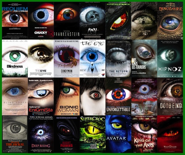
As you can see above, Hollywood has an obsession of featuring one eye on its posters. As you can see below, they also like to feature stars standing back-to-back.

For a while there, they really got cute and put reflections in sunglasses on posters.

And, have you ever noticed that all of the independent films have yellow posters?

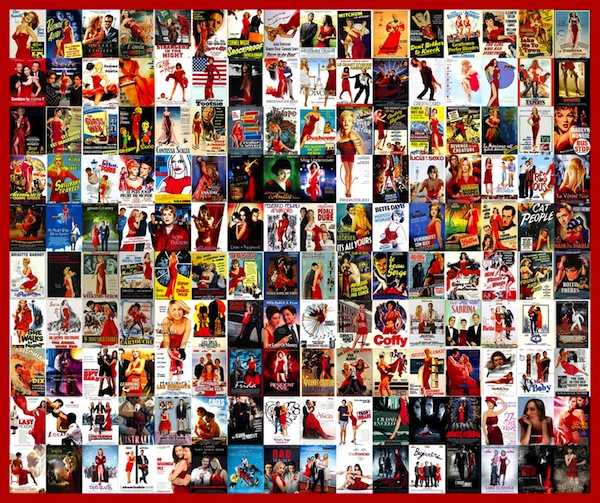
Finally, if you're a woman on a movie poster, there's a good chance that you'll be wearing a red dress.
You get the idea and I strongly recommend checking out Christophe's full site here for many more examples. The site is in French, but don't let that stop you. As a visual representation of these trends, the idea translates across any language.
The poster images themselves aren't the only archetypes in movie posters. Oh no, our good buddy Kirby Ferguson checks in with the overuse of the font Trajan.
All of this is prelude to what I teased earlier, the new poster for Star Trek Into Darkness. And without further ado, here it is:
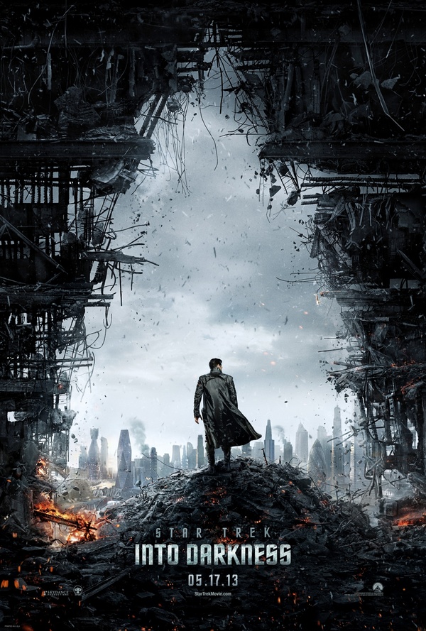
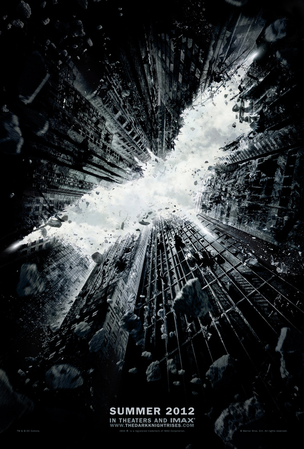
If it looks familiar, it should. You might recall that The Dark Knight Rises used a very similar design in creating the bat logo from negative space. Over at /Film, they have compiled similar posters that feature the destruction motif.
That all being said, I'm not saying that it's a bad poster per se, but I was hoping for something a little more trend setting. It's definitely better than this vanilla poster from the first film.